EDS Reponsive Menu - WordPress Plugin
Documentation v.1.2
- Created: 06/08/2016
- Latest update: 06/08/2016
- By: eDatastyle (eds)
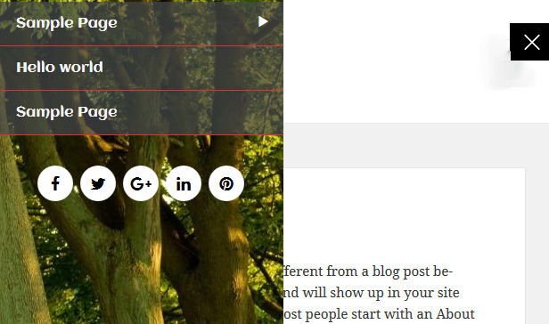
A set of fixed menus that will slide out from any of the edges of the page. The two menus that slide out from the left and right side can also be used in combination with the body moving to the left or right side, respectively, hence being “pushed”.
INSTALATION
There are two options for installing the Supreme Shortcodes WordPress Plugin: either upload the zip file using the WordPress Plugin Uploader or FTP the unzipped plugin files to the wp-content/plugins folder on your server.
ADDING PLUGIN USING THE ADMINISTRATION PANELS
You can download Themes directly to your blog by using the AddNew Themes option in the Appearance sub-menu.
- Log in to the WordPress Administration Panels.
- Select the Plugins -> Add New
- Select Upload link.
- Click Choose File and locate the plugin package zip file that was included inside the download
- Click Install Now
ADDING PLUGIN MANUALLY (FTP)
To add a Plugin to your WordPress installation, follow these basic steps:
- Unzip the zip file that was included with the plugin download.
- Once unzipped, you will have a folder titled SupremeShortcodes - this is the plugin content
- Using FTP, upload the SupremeShortcodes folder to wp-content/plugins on your server
- Log into the WordPress admin panel
- Navigation to Plugins
- Under "Supreme Shortcodes WordPress Plugin" click activate
REQUIREMENTS
Supreme Shortcodes WordPress Plugin requires WordPress 3.6+
SOURCE
wordpress codexInitial Setup
Although the plugin works straight out of the box with no configuration needed, of course it is nice to make it more specific for your website.
Assigning a Menu
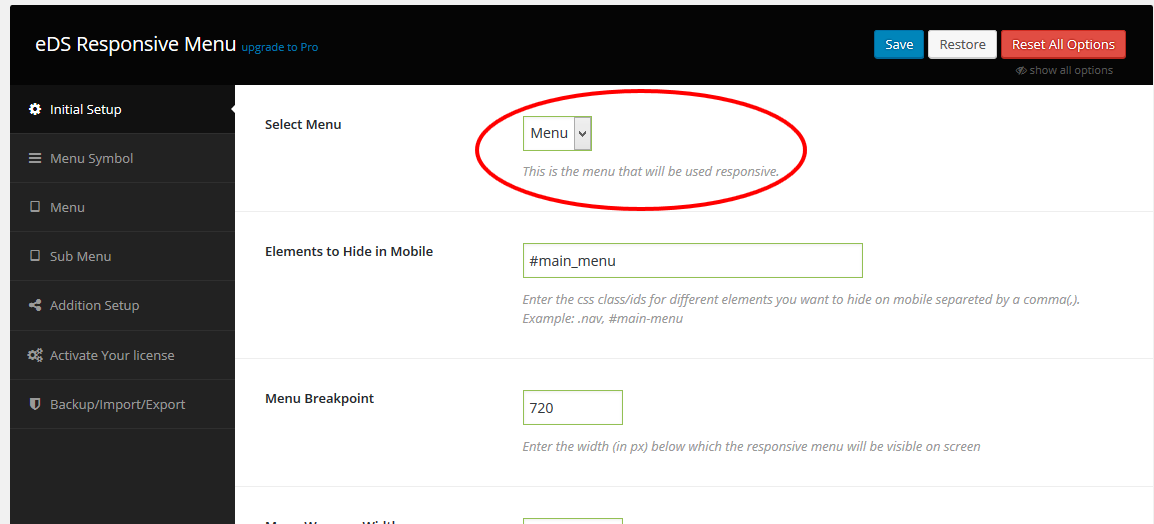
First thing you need to do is install and activate the eDS Responsive Menu page plugin. Upon activation, you need to visit eDS Responsive Menu page to configure the plugin settings.
You need to choose a menu from the drop down list. If you have not created a navigation menu yet, then check out our guide on how to add navigation menus in WordPress.
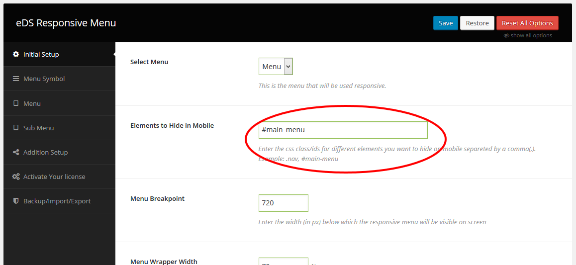
Hide Current/desktop Menu
Once you have chosen the menu you would like to make responsive on your site, the next thing you need to do is hide your original menu when the responsive menu begins to show.
Choose a Breakpoint
All you have to do to determine at what browser size the menu will be triggered is to fill out the Responsive Menu admin option labelled Breakpoint under the Initial Setup tab.
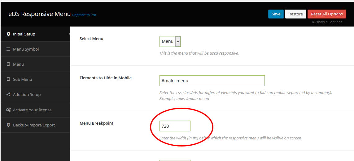
Setting the value to something extremely high, 50000 for example, will mean that the Responsive Menu will always show.
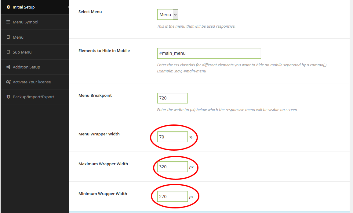
Menu Wrapper Sizing
You have the ability to change a few settings in regards the menu itself sizing, each of which is explained below:
- Menu Width – The width as a percentage of the total screen that the menu takes up when expanded.
- Maximum Width – The maximum width in pixels that the menu can take up.
- Minimum Width – The minimum width in pixels that the menu can take up.
Setting the Maximum and Minimum Width settings to the same value will give you a fixed width menu
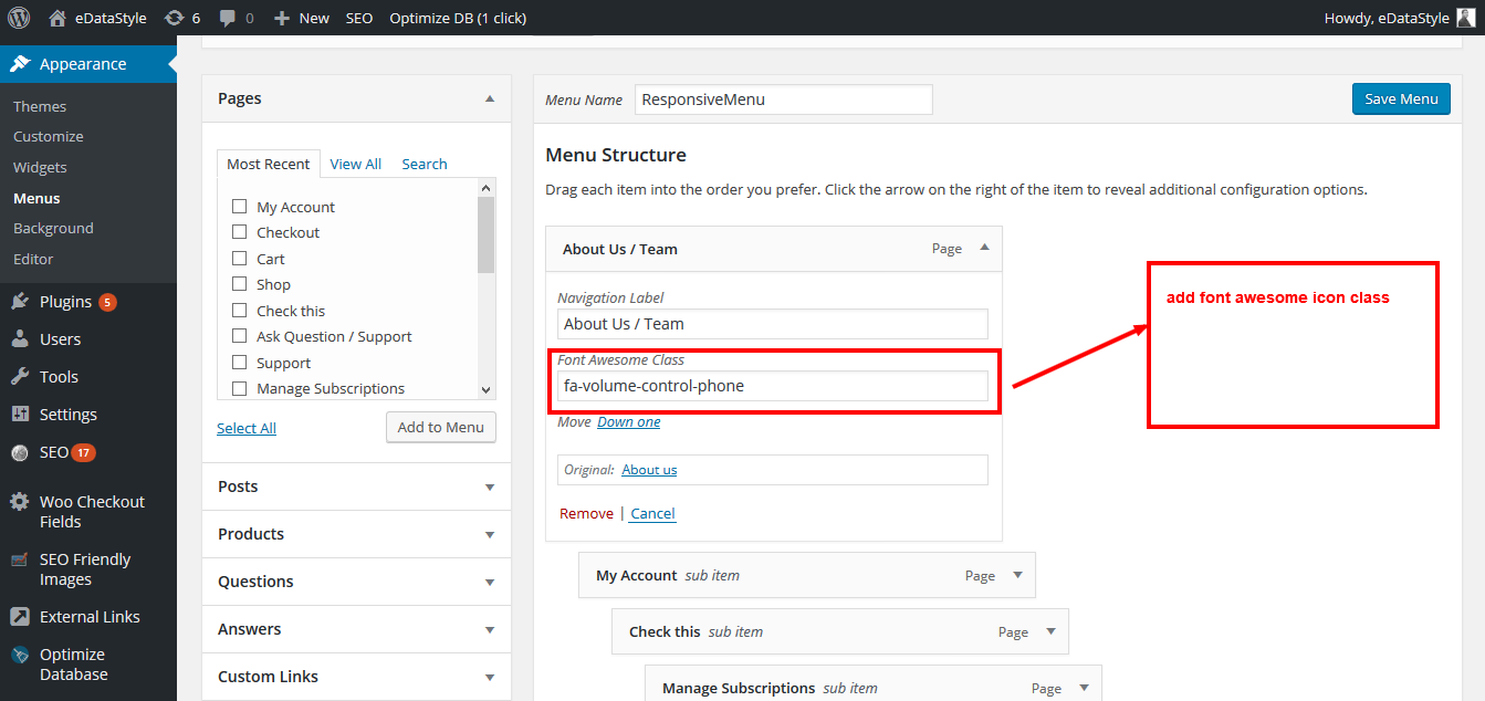
Font Awesome Settings
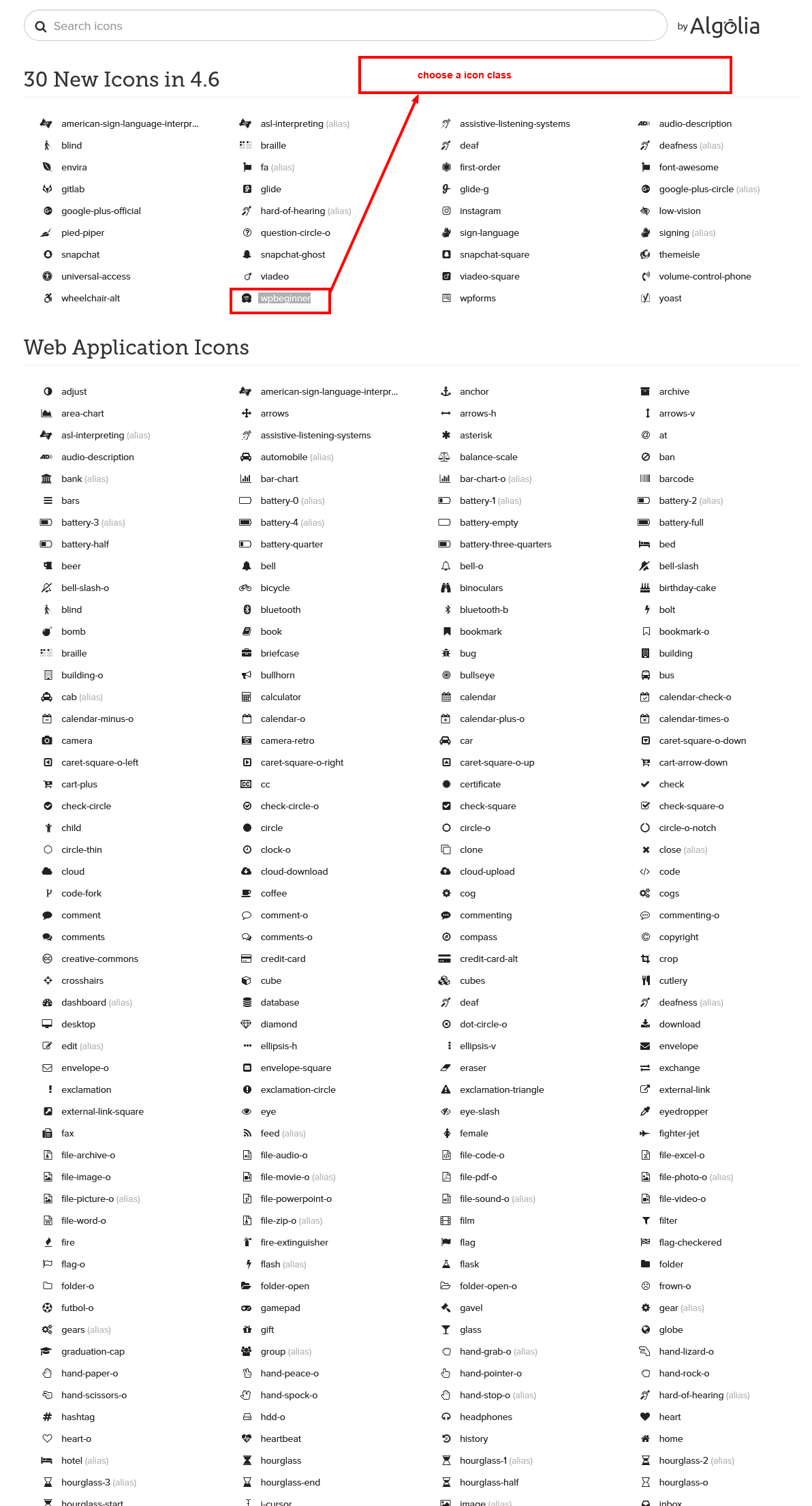
Add Font Awesome icon name or class inside custom menu
Setting the Menu Edge
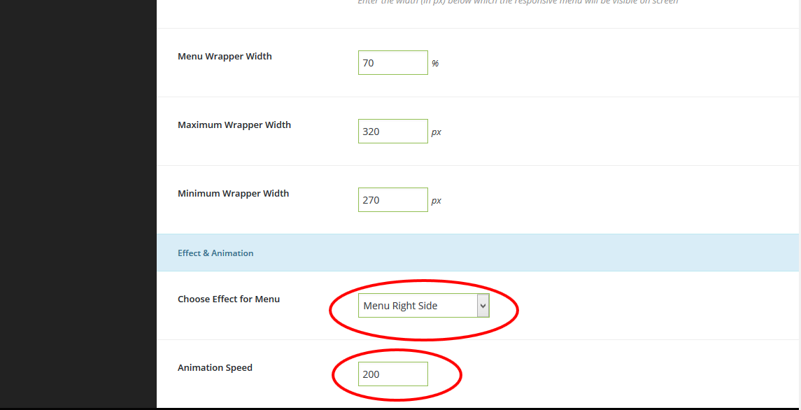
Toggles
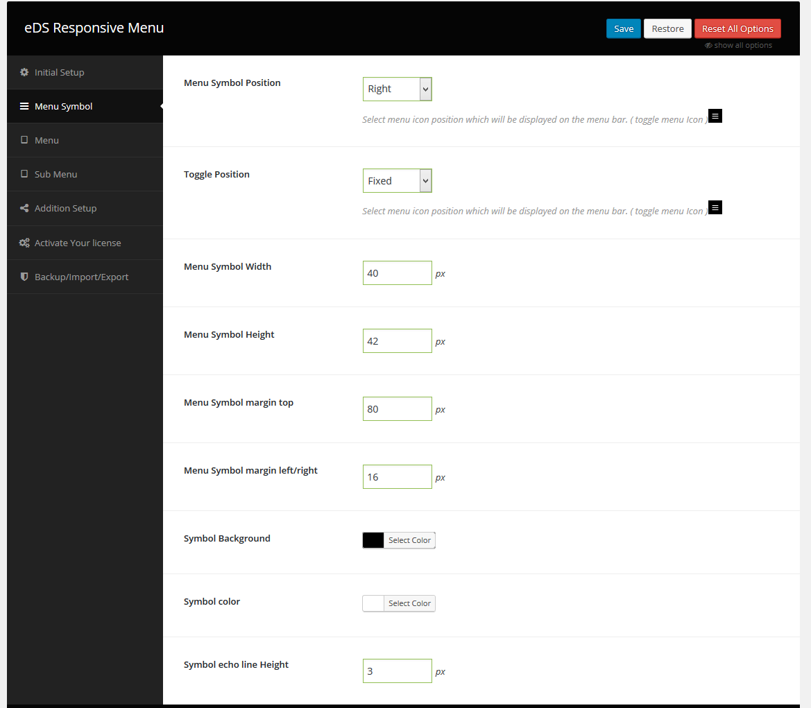
EDS Responsive Menu > Menu Symbol
Below we will run through some of the customisation options for its usage.
Menu Configuration
EDS Responsive Menu > Menu Symbol
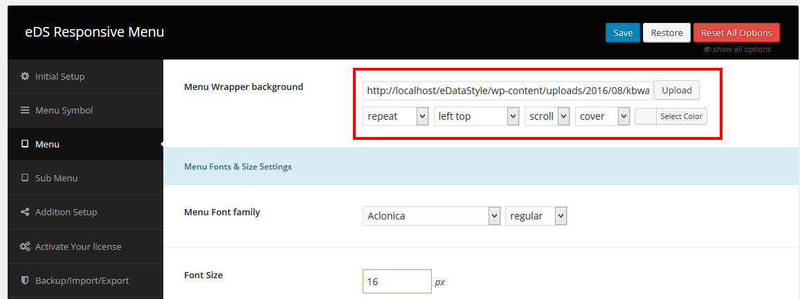
Menu Wrapper background
You can Choose background Image , Gackground Color or empty. As your wish.
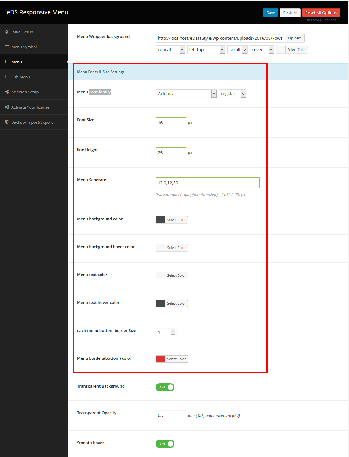
Menu Configuration (Level :1)
Note: In Pro Verions you will get all google fonts
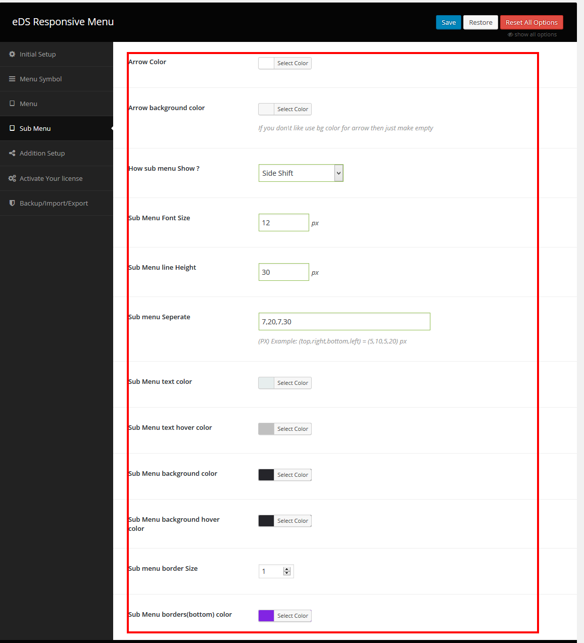
Sub Menu
EDS Responsive Menu > Sub Menu
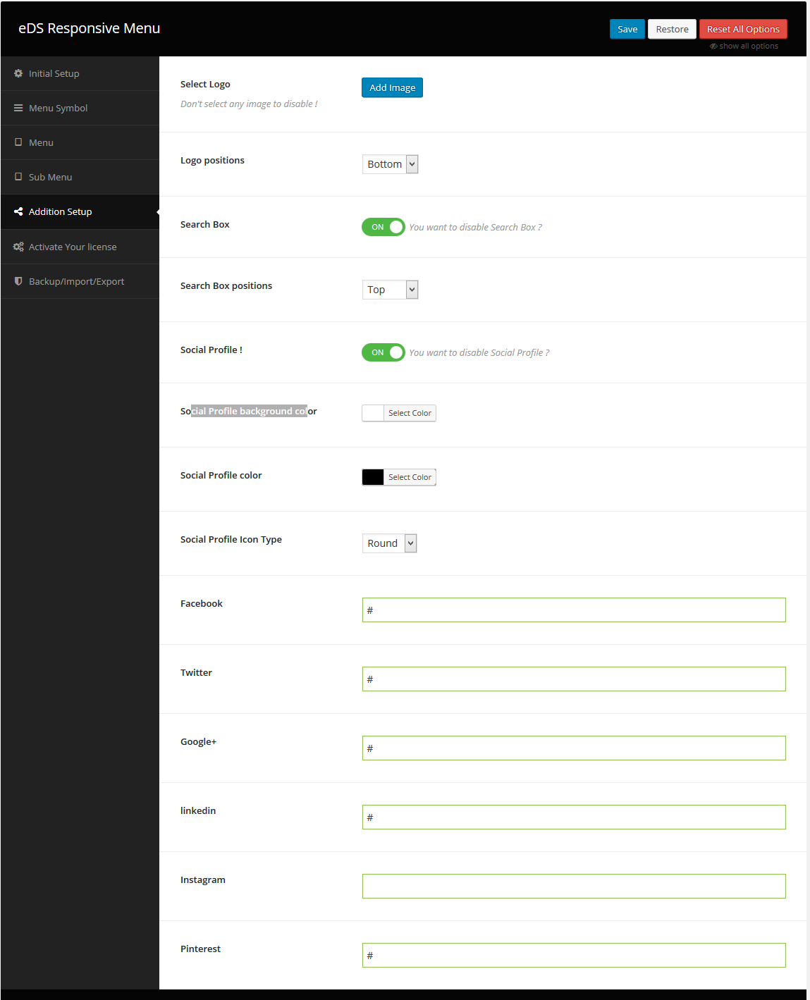
Addition Setup
EDS Responsive Menu > Addition Setup
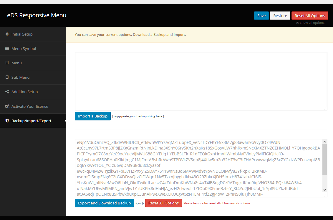
Backup/Import/Export
EDS Responsive Menu >Backup/Import/Export
Feedback
We do our best to make your life easier with the Free support. Your feedback is valuable for us. We would love to hear from you.
If you have any suggestion, positive comments or comment of suggestion, please feel free to contact us and we'll get in touch as soon as possible.